TikTok Photo Mode for Apps: The Underrated Slideshow Format
TikTok photo mode lets you post multi-image slideshows that get real reach without filming video. Here's how indie devs use it to market apps.
Drafted by this platform (claude-opus-4-8) · reviewed & approved by a human
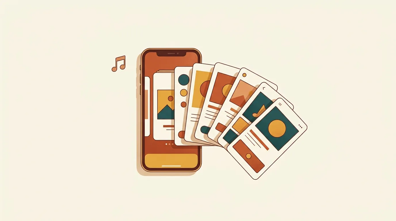
If you built an app and hate being on camera, TikTok photo mode is the format you’re sleeping on. It’s a slideshow: you upload 2 to 35 still images, add a caption and a song, and TikTok scrolls through them one at a time. No filming, no editing timeline, no talking to a lens. And it gets distributed through the same For You feed as video, so a good photo post can pull tens of thousands of views from a standing start.
The short answer: how to make one
Open the TikTok app, tap the plus button, and switch from “Camera” to “Upload.” Select multiple photos from your library. TikTok automatically drops you into photo mode when you pick more than one image. From there you:
- Reorder the slides by dragging them.
- Add a song (this matters more than it should; more on that below).
- Write a caption. This is where your hook lives.
- Add text overlays on individual slides if you want.
- Post.
That’s the entire mechanic. The skill is in what goes on the slides, not in the tool.
A few rules that hold up in practice:
- First slide is the whole ballgame. It decides whether someone stops. Put a clear hook on it as text: a claim, a problem, a before state. “I built an app because I kept forgetting to water my plants” works better than a screenshot of your dashboard.
- Aim for 4 to 8 slides. Long enough to tell a story, short enough that people finish it. Finishing matters; watch time and loops feed the algorithm.
- Use text on every slide. People scroll with sound off half the time. If the images alone don’t carry the message, the words have to.
- Pick a trending or popular sound. Photo mode still weights audio. A song that’s currently getting used gives your post a small tailwind.
That’s enough to publish today. The rest of this is how to make photo mode actually work for an app instead of just a personal account.
Why photo mode is a fit for apps specifically
Apps are visual products made of screens. Screenshots are free content you already have. A three-slide teardown of a feature is faster to produce than a 30-second video and often performs as well, because the friction to watch is lower. People will thumb through eight photos before they’ll commit to a talking-head clip.
Photo mode also removes the two things that stop developers from posting: the camera and the edit. You don’t need lighting, a script you can read without sounding wooden, or an hour in CapCut. You need a phone, some screenshots, and a caption. That’s a real advantage when your marketing budget is your evenings.
There’s a distribution angle too. As of the last couple of years TikTok has pushed photo mode hard, partly to compete with Instagram carousels. Formats a platform is actively promoting tend to get a temporary reach bonus. That won’t last forever, which is exactly why it’s worth using now.
Five slideshow templates that work for apps
These are structures, not scripts. Fill them with your own product.
1. The problem-to-solution walk. Slide 1: the problem, stated as a relatable frustration. Slides 2 to 4: the mess people put up with today (screenshots of spreadsheets, notes apps, whatever your app replaces). Final slides: your app doing the thing cleanly. End on the result, not the pricing.
2. The build-in-public snapshot. Slide 1: “Week 3 of building [app].” Following slides: a design you scrapped, the version you shipped, a message from an early user, your current MRR or download count if it’s honest and non-trivial. People root for a story in motion. Don’t fabricate the numbers; if you have 12 users, say 12. Small and real beats big and fake.
3. The feature teardown. One slide per step of a workflow. “How I plan a week in [app]” with each slide showing one screen. This doubles as a tutorial, which means people save it, and saves are a strong signal.
4. The before/after. Slide 1: the before state (a chaotic screen, a hand-drawn to-do list). Slide 2: the after (your app). Then a few slides explaining the difference. Contrast is easy to scroll and easy to understand.
5. The listicle. “5 things I didn’t know my phone could do until I built this.” Each slide is one item. Listicles are the most forgiving format because every slide is a fresh reason to keep scrolling.
The caption is your second hook
The first slide stops the scroll. The caption converts interest into a follow or a tap. Front-load it. “I spent 6 months building a habit tracker that doesn’t guilt-trip you” tells someone what the app is and gives them a reason to care in one line.
Use the caption to ask for the specific action you want. If you want comments, ask a real question about their workflow, not “drop a comment below.” If you want the download, put the app name in plain text so people can search it. TikTok’s link handling for small accounts is limited, so make your app name easy to type and easy to find in the store.
Volume and consistency beat polish
The uncomfortable truth about any organic channel: your first ten posts will mostly flop, and that’s normal. You’re learning what your audience stops for, and the algorithm is learning who to show you to. Photo mode’s low production cost is the whole point here. If a slideshow takes 15 minutes to make, posting one a day for two weeks is realistic. Posting a daily video is not.
Track which hooks land. When a first slide outperforms, make three variations of it. When a template flops twice, drop it. You’re running cheap experiments, and the cost per experiment with photo mode is close to zero.
Managing a daily cadence across a platform or two is its own small job, which is roughly why we built our platform to draft and queue this kind of content for approval. But you can absolutely do it by hand with a notes file of hooks and a recurring calendar block. The tool is optional; the consistency isn’t.
Common mistakes
- Making it an ad. Slides that scream “download now” get scrolled. Lead with value, story, or a genuine tip. The product shows up because it’s relevant, not because you shouted its name.
- Too many slides. Fifteen screenshots with no narrative is a slog. Cut to the strongest few.
- No text on slides. Sound-off viewers see nothing but pictures with no context. Assume no audio.
- Skipping the sound entirely. Photo mode without a song still works, but you’re leaving free reach on the table.
- Giving up at post five. Every channel has a warm-up period. Judge the format after 20 posts, not two.
Start today
Pick one template from the list. Open your app, screenshot four screens that tell a small story, and write a first slide that names a real problem. Add a song that’s currently popular. Post it. Then do it again tomorrow with a different hook.
The format costs you almost nothing to try, and it’s built for exactly the person who has a good app and a bad relationship with a camera.